
As per the design and development perspective, the most obvious way to learn is to observe the apps which have already hit the success stage. No, no, it doesn't mean to copy most valuable features of successful apps, it means to examine – the features and functions that make an app look and work wonderfully – and apply the lessons (learnt from successful apps) to your own app projects.

When it comes to successful apps, image of popular iOS and Android apps start prevailing in your mind, and surely, you will start your browsing with those apps. Here also, a list of successful apps is described with their most appreciable features – to make you learn some important design and development lessons – that will definitely nurture your app projects.
Google+ - A Measurable Difference Between Web and Mobile Experience
Google+ - A Measurable Difference Between Web and Mobile Experience

Google+ is a great example of uniqueness as per the viewpoint of web and mobile users. Both of them are happy with a distinct experience of Google+ from two different devices. Common functions are surely there, but the design is completely different with an easy to touch, navigate and share on your fingertips.
StockTouch – A Simple Display of Complicated Information
StockTouch – A Simple Display of Complicated Information
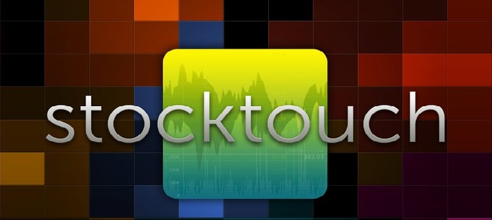
The biggest challenge for mobile app development companies is to make an app that can explain the most complicated data in a simple and understandable manner. StockTouch – stock market analysis and tracking app – is a great example of this challenge. It is a storage of tons of information categorized in different sectors. Each group has a detailed information, revealed while tapping. Charts are designed to make the information more digestible. Beyond the textual information, it has a stream of colors to display each stock movement.
Path – Slide-out Navigations Are Pretty Fine to Touch
Path – Slide-out Navigations Are Pretty Fine to Touch

Remarkable quality of Path (social networking app) is its sliding navigation from both the left and right side. Left side slide takes you to the menus and notification area while right side slide takes you to the details of friends and the search area.
Spotify – A Better Experience from Mobile than Desktop
Spotify – A Better Experience from Mobile than Desktop

iOS and Android users are more happy from Spotify than Desktop users. Because of its better user experience with big cover art, easy navigation and an easy to use search and sharing features, Spotify proved that mobile experience can be better than Desktop experience. Team of Spotify thoroughly described the importance of designing for portable devices.
News.me – Beautifully Reformatted Presentation
News.me – Beautifully Reformatted Presentation
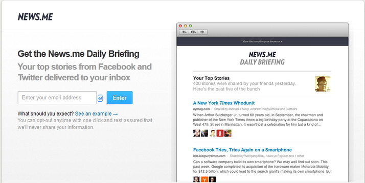
News.me brings up a beautiful presentation of news in a way that one would enjoy to read it. News reformats its design while tapping, giving better readable experience. It also uses typography along with beautifully designed searching and sharing features.
Sparrow – Detailed-Centric App
Sparrow – Detailed-Centric App
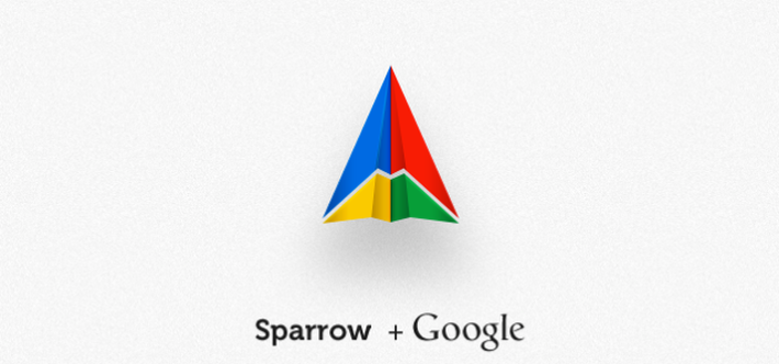
Sparrow is designed to provide better gmail experience. Yes, there is already an app from Google itself, but Sparrow is widely known for its detailed information. Its entire features are well designed with a detailed information on each one. Slide-out navigations, persistent replies and ease to add attachments, all are just peerless and perfect.
Just Landed – Clear-cut Typography
Just Landed – Clear-cut Typography

Just landed app lets you track inbound flights and plan routes to reach the airport on time. When you should leave for the airport is elegantly described by this app from its simply designed interface. Its interface is full of text, still its clean and clear to understand typography. It reveals how one can explain appealingly only with the help of text.
Evernote – Android Looks Better than iPhone
Evernote – Android Looks Better than iPhone

Android version of Evernote confirmed that app experience can also be better with Android, rather than iOS. Clean, clear and crisp notes are viewed through Evernote Android app because of its crystal clear sliding navigations and other flawless features.
Conclusion
In the whole article, navigational slide-outs are given utmost attention as they are the one that can make a successful app or can ruin it. The more it is easy to use slides, the more users will feel comfy to keep the app for a long time. Other than this, clean and clear understanding is necessary for an app, so that it can let the users' understand what it makes sense of. An app must be developed for users, they must feel to use it with ease, and must able to make it a part of their daily routine.
See Also: Top 10 Questions Asked by New Mobile App Developers